Imagine opening a website and the text is too small to read.
Or watching a brand video with no captions.
Or scrolling through a beautiful ad that forgets to represent people like you.
Design isn’t just about how something looks — it’s about who feels welcome when they see it.
As India goes digital at lightning speed, inclusive and accessible design has gone from a “nice-to-have” to a must-have. Because true creativity isn’t just eye-catching — it’s heart-reaching.
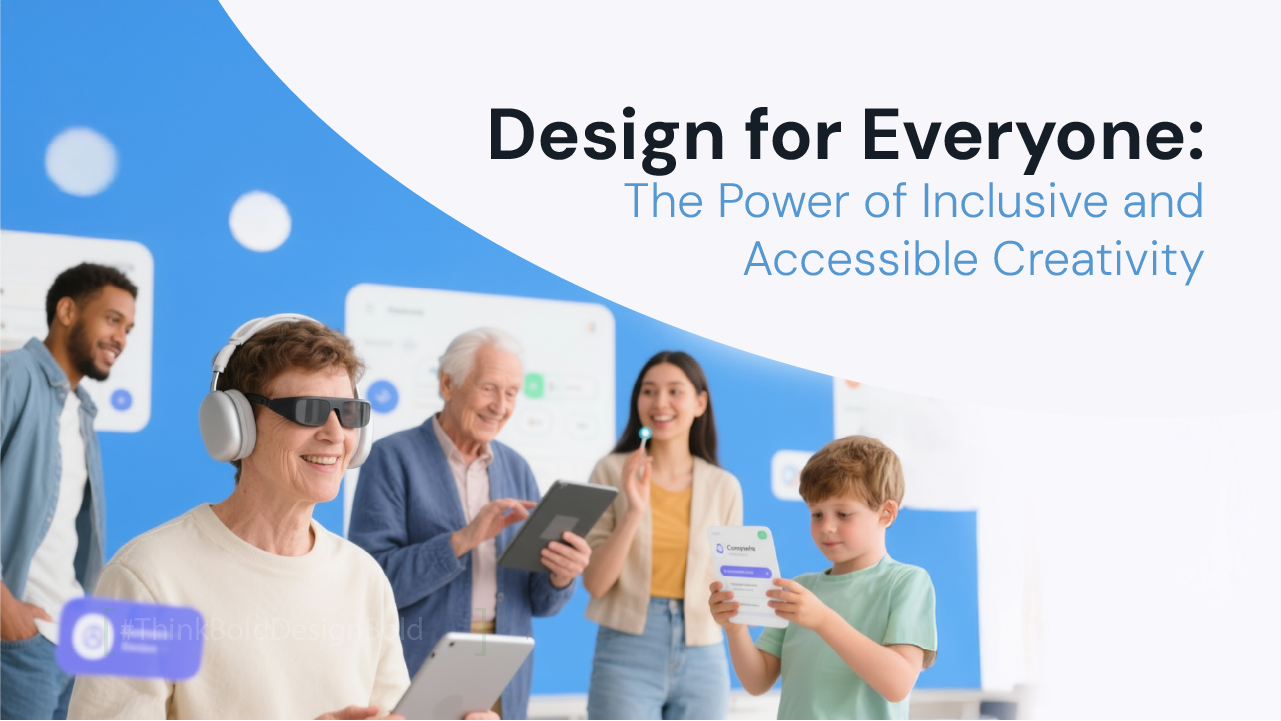
What Inclusive Design Really Means
Inclusive design ensures that everyone, regardless of ability, age, language, or background, can access and connect with a brand’s message.
Accessibility goes one step further — it removes barriers that prevent people from using products or consuming content.
Simply put:
- Inclusive design = designing for everyone.
- Accessible design = designing so everyone can use it.
It’s the difference between saying “we care” and proving it through design.
Why It Matters Now (Especially in India)
India has over 70 million people with disabilities, according to the 2011 Census, and the number is likely higher today. Add to that a massive linguistic diversity — 22 official languages and hundreds of dialects — and you realize how easily design can exclude if it isn’t thoughtful.
Add to that the mobile-first reality: 85% of Indian users access the internet primarily via smartphones. A cluttered design or small font isn’t just inconvenient — it’s exclusion.
In a country this vast and varied, inclusive design isn’t just ethics — it’s smart business.
The Emotional Power of Inclusion
When design includes everyone, it builds belonging. And belonging builds loyalty.
A visually impaired user who can navigate your website easily will remember your brand.
A non-English speaker who finds product information in their language will trust you more.
A customer who sees people like themselves in your ads will connect deeper.
Inclusion doesn’t just make people feel good; it makes them feel seen.
Real Indian Examples That Got It Right
1.
Swiggy’s “Voice of Hunger” Campaign
This campaign went viral because it let everyone participate — not just designers or influencers. Using voice notes to draw doodles, Swiggy made creativity inclusive and accessible to every smartphone user.
2.
Google India’s “Search in Your Language”
Google localized its interfaces and even voice commands in 9 Indian languages. That single step made millions of first-time users feel at home online.
3.
Narayana Health’s Website Revamp
The hospital’s new site includes screen-reader compatibility, large fonts, and clear navigation — critical for elderly users and caregivers.
4.
Microsoft’s Seeing AI App Launch in India
The app narrates text and identifies objects for visually impaired users, now localized in Indian languages. Proof that accessibility and innovation go hand in hand.
Common Mistakes That Make Design Exclusionary
- Tiny fonts and low contrast – Stylish but unreadable.
- English-only communication – Limits reach in multilingual India.
- Stock imagery stereotypes – Overuse of Western or idealized visuals.
- No alt-text on images – Screen readers can’t interpret visuals.
- Poor color choices – Red-green contrasts are difficult for colorblind users.
- Ignoring cultural nuances – Overly global tone that feels “out of place” locally.
Accessibility is not about being fancy — it’s about being functional.
Designing for India: Diversity as a Strength
Indian design requires sensitivity, not sameness. Here’s how brands can approach it thoughtfully:
🔹 1.
Design for Different Devices and Realities
A webpage that loads perfectly on Wi-Fi may lag on 4G. Optimize for smaller screens and slower networks — because accessibility also means affordability.
🔹 2.
Use Language that Speaks to People
Brands like Flipkart and JioMart now use Hinglish (“Order kar lo!”) to make their content feel natural. Even simple bilingual buttons like “Add to Cart / कार्ट में जोड़ें” widen access instantly.
🔹 3.
Represent Real India
Show real people — different skin tones, regions, body types, and abilities.
Representation is not tokenism; it’s authenticity.
🔹 4.
Design with Empathy, Not Assumptions
Don’t assume every user is young, tech-savvy, or English-speaking. Think about your elderly users, rural customers, and people with limited literacy.
🔹 5.
Test with Real Users
Involve diverse audiences during design testing. Their feedback reveals barriers you can’t see from a boardroom.
Accessibility Tips for Everyday Design
- ✅ Use large, legible fonts (minimum 16px).
- ✅ Ensure strong contrast (black text on white, not grey).
- ✅ Add captions and transcripts to all videos.
- ✅ Write alt-text for every image on your website.
- ✅ Avoid auto-playing sound — it disrupts screen readers.
- ✅ Use icons and visuals with clear meaning (not abstract art).
- ✅ Keep navigation intuitive — simple menus, fewer clicks.
- ✅ Don’t rely solely on color to convey information.
Small steps make big differences.
Cultural Accessibility: A Hidden Layer
Designing for accessibility in India also means designing for culture.
Colors, symbols, and imagery carry deep meanings here.
- White represents purity in the South but mourning in the North.
- Red stands for celebration and energy, but too much can signal danger.
- Images of families and festivals instantly create cultural connection.
Inclusive design must account for emotion, not just ergonomics.
The DarkBox Perspective: Design That Welcomes
At DarkBox, we see design as empathy in motion.
We’ve worked with brands across industries — from education and healthcare to retail — to make their experiences not only beautiful but accessible to all.
When we design a website, we don’t just ask, “Does it look good?”
We ask, “Can everyone use it?”
We integrate accessibility principles in everything we create:
- Simple layouts for easy navigation.
- Readable fonts and logical content flow.
- Voice and alt-text for inclusivity.
- Representation in visuals and tone.
One of our education clients saw a 40% increase in engagement after we introduced a bilingual interface and simplified navigation for parents and students from semi-urban areas.
That’s proof that inclusivity isn’t just the right thing — it’s the smart thing.
The Way Forward
Inclusive design is not charity. It’s clarity. It’s connection. It’s common sense.
In India, where billions of stories exist, a brand that designs for everyone automatically becomes a brand for someone.
When your product, website, or campaign makes everyone feel they belong — from a child using a screen reader to a grandparent reading in Hindi — you’re not just designing interfaces.
You’re designing impact.
Because the most beautiful design isn’t the one that wins awards — it’s the one that no one feels left out of.